Location
Ukraine
Category
Investments
Scope
Naming / Communication platform / Visual identity
Challenge
Investing has always looked intimidating: thick presentations, complicated charts, endless consultations.
For most people, it felt like “this isn’t for me.”
Snap Invest came in with a different vision: to show that investing can be as simple as swiping or sending a message.

Idea
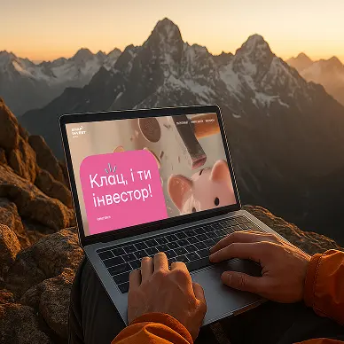
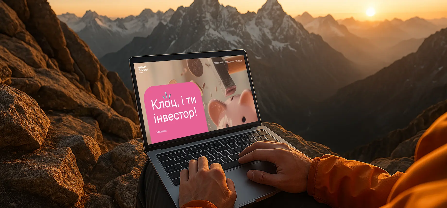
One snap, and you’re in.
We live in a world where everything happens in the in-betweens.
Between a meeting and a coffee.
Between a TikTok scroll and dinner with friends.
So why should investing feel heavy, complicated, or out of reach?
Snap Invest makes it effortless — investing that fits seamlessly into your everyday life.
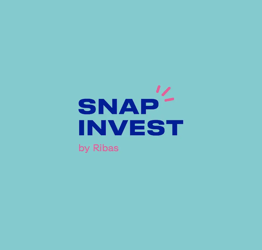
Naming
The name Snap Invest was born from a sense of immediacy.
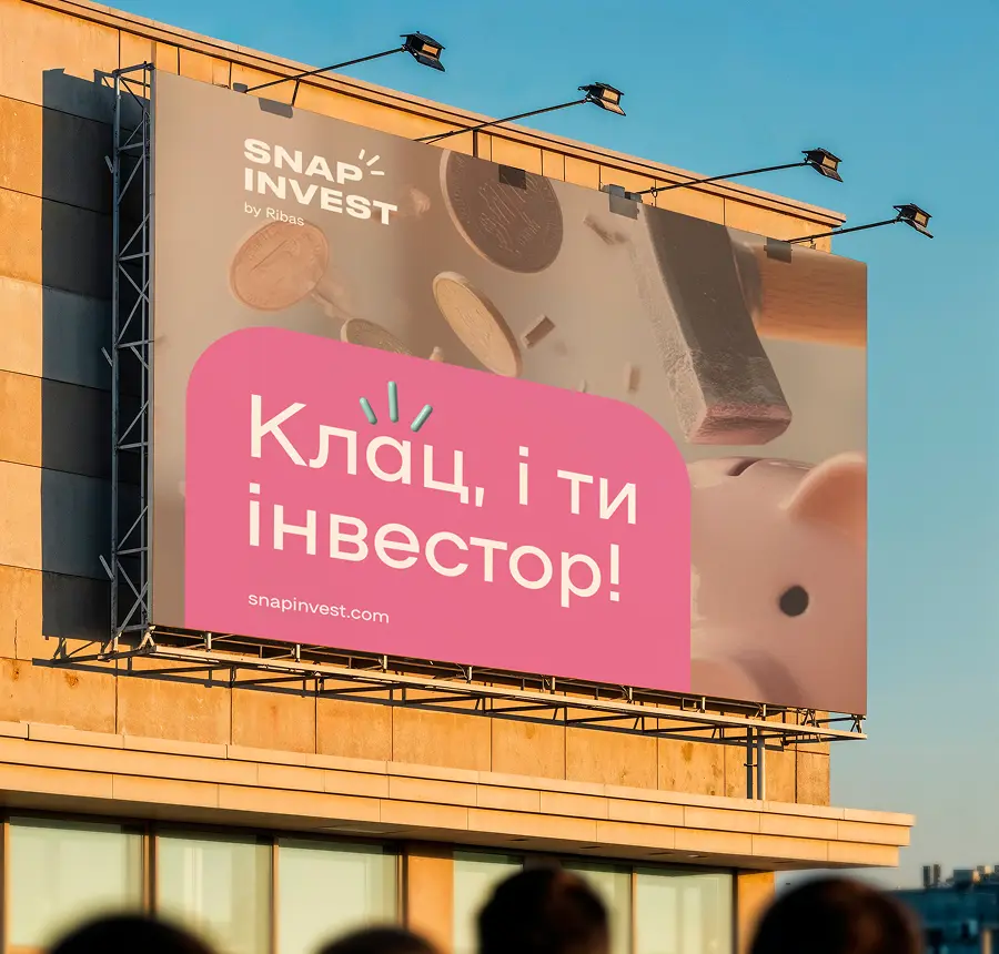
“Snap” — like the snap of your fingers. Snap — and it’s done.
We wanted investing to sound not like a complicated process, but like a quick, intuitive action anyone can take.

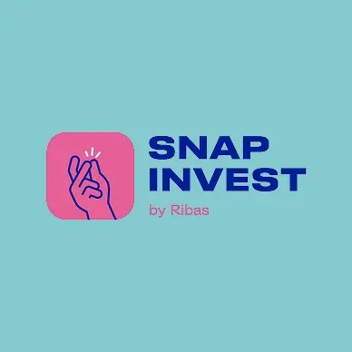
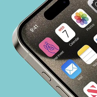
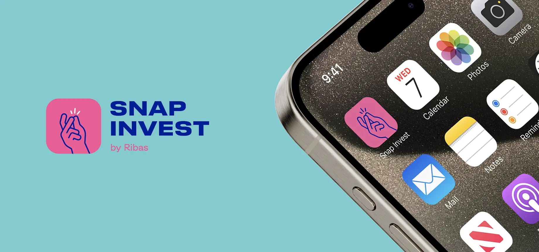
Visual Identity
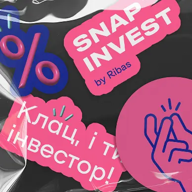
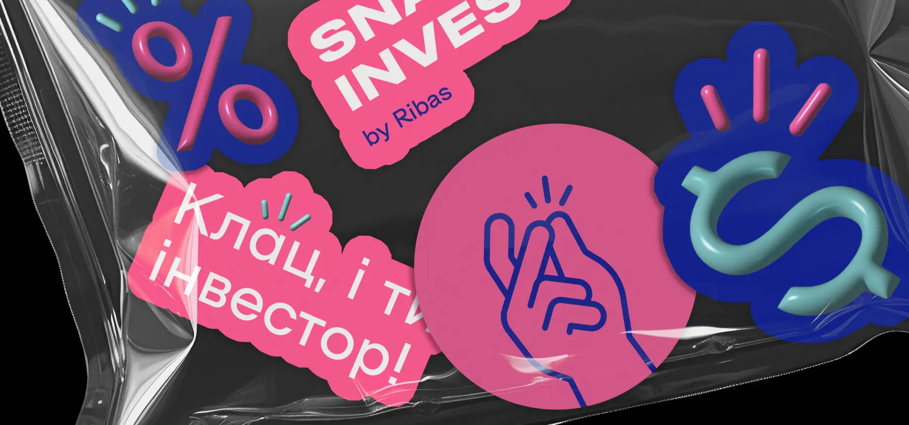
The identity is built on simplicity and ease.
Clean colors, clear shapes, a logo without unnecessary seriousness.
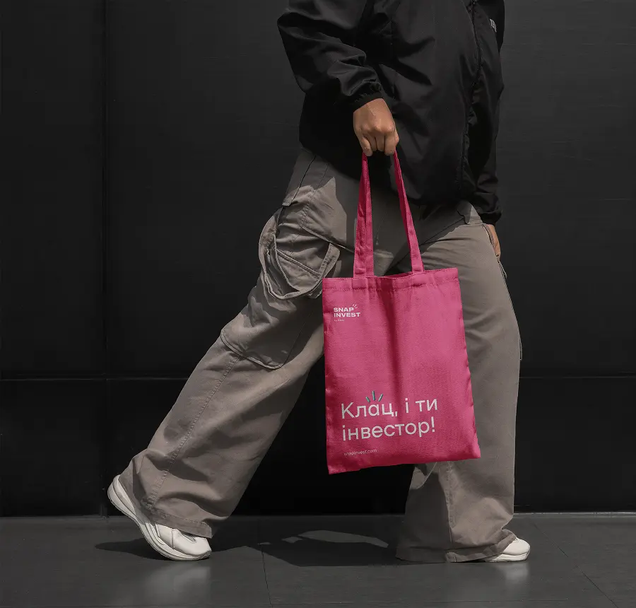
And the main accent — the “snap”: a sound and a gesture that became both the visual and audio symbol of the brand.
Not a rigid banking suit, but a T-shirt that goes with any day of the week.
Communication
We stepped away from the language of financial advisors.
Snap Invest speaks like a friend, offering a simple solution:
Messages:
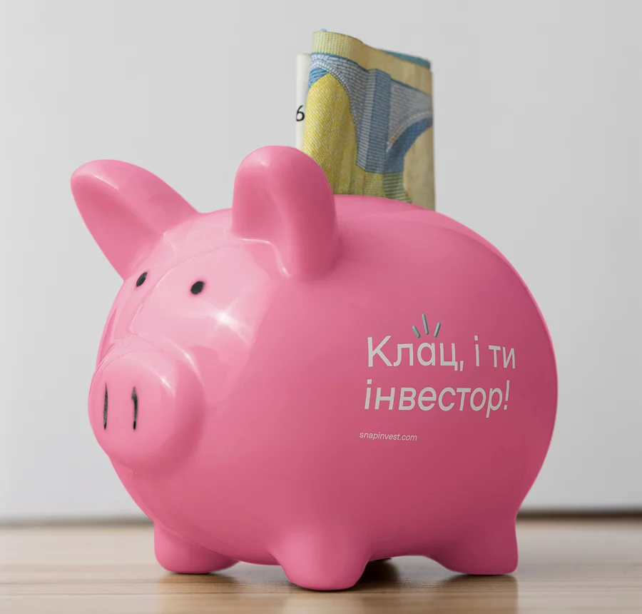
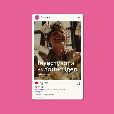
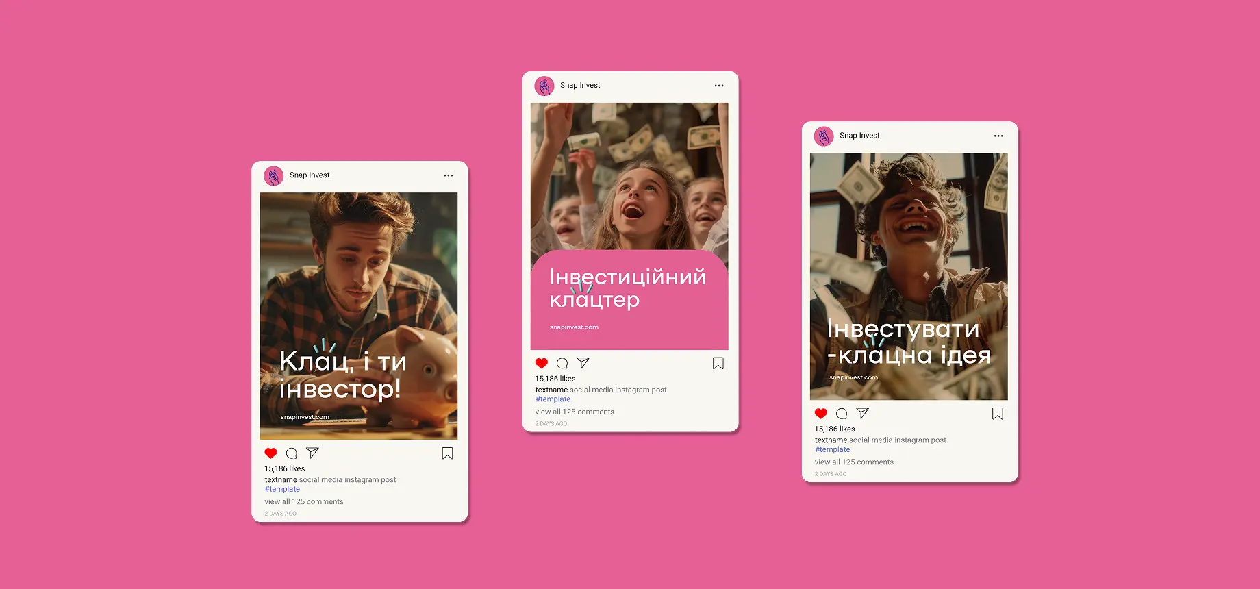
“One snap, and you’re an investor.”
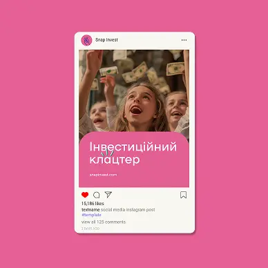
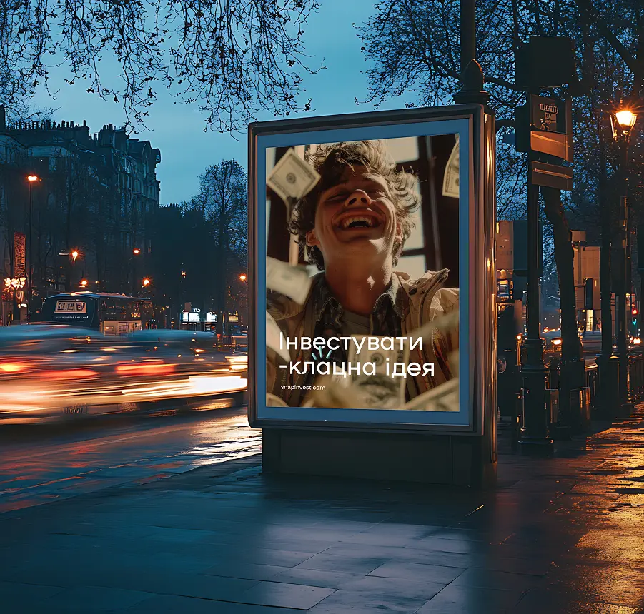
“Invest in between.”
“Simple relationships with money.”
The tone is ironic, light, and never pretentious.

Result
Snap Invest got a brand that doesn’t intimidate — it encourages.
The name became the message.
The style — recognizable.
The videos — an emotional hook.
Most importantly, investing stopped feeling like “someone else’s world” and started looking accessible to everyone.
One snap, and you’re in.
Let’s Co-Create